Introduction
So this is my first time trying animation, well I did technically try it before in college but it was very sloppy, so I want to make this better.
This is for my platformer so I knew I needed some basic things, a idle, walk, attack and jump as those are the things you can do on basically every platformer so it just makes sense to cover those.
Character Concept
I was originally going to do my samurai character again but after a few attempts it was just too hard to get down as a first so I went for something more basic. I am a bit obsessed with Elden Ring and fantasy so wanted to go for something like that, however then the idea of the ring knights from the ringed city in Dark Souls 3 popped in my head, these ominous and strong knights. I took my own spin on it, no hole in the chest and a whip, since like nobody makes whip characters and thought animating its movement compared to a sword would be more fun, especially since I’m pretty sure everyone else is going to default to that.
I also drew abit of the concept from a old character I made for my first game which ended up breaking and never becoming a reality, I took the idea of a cloaked mysterious knight from them, removing the glowing eyes however as I liked the idea of a restricted color palette too, plus more ominous.
Line Art
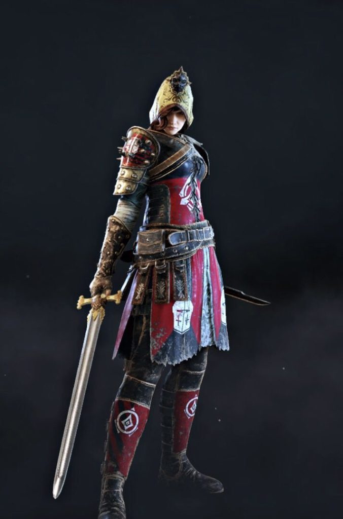
To start we need a base since I’m not good enough with anatomy yet to do just from scratch, for this I just used the peacekeeper from For Honor as they have the hood and light armor we are going for
So first I got the base image which is this:
However we want a pixelated look so therefore we need to zoom in, so I make a small canvas and paste it, making it fit on the size, making it into this:

Then just outlined that in blue so it stands out (not taking the sword because we want a whip)
Then I added another to add our cloak, in green so I could tell which was which

Color
Then we obviously need to add some color, filling in the holes left after removing the outline and filling it in.
And make the whip of course, which was from scratch as just a black handle and the rope honestly into a shape that looked nice, making this.

That is it, pixel art is alot easier than I expected, however it isn’t over as this is only one frame and this is animation
Idle
Now that we have a character and a basic stance, let’s add a idle to to give them some personality even when you’re not moving, my idea behind it was when people drop a football and kick it back up into their hand. Atleast that is the best example I can think of, probably is a better one more specific to why I’m doing it with a whip, but oh well.
So the plan is to make them drop it onto the foot and then kick it back up into their hand, because making the frames was easier than expected, I just have the final frames but because there are not many changes between them I can just explain the changes as we make progress.
First Frame

Okay so this one literally changes like nothing, all I did was move the whip in their hand abit so it is in a better dropping position, trust me it does get better.
Second Frame

See? Now they have dropped it and moved their foot out to catch it, I am also quite happy with how the whip is turning out in these, was alot easier once I did it a few times than I expected.
Third Frame

Okay then it lands on their foot ready to be kicked back up, the hardest part was definitely making the whip coil up without just starting to defy gravity, however I think this looks good.
Forth Frame

Okay then here is the last frame, it is pretty weak because the leg looks like it is broken but again I did not know how to make it look like a kick without breaking their leg as funny as that sounds. Hopefully in the future I can get better at anatomy and have to break less legs in the future.
Then just so you can see how they link together I put them next to each other (not sure how to make gifs so thought this would be just as good)


These turned out pretty well and I’m happy with the loop, even if it has its hiccups but those are expected for my first and I am honestly happily surprised how easy it was to make the transitions from one to the other since most say animation is super hard. However I think it is just the anatomy that is going to be the problem personally
Walk Cycle
Okay then next I wanted the character to move, and for that we need them to be able to walk, so we need a walk cycle, this will be interesting as most say walk cycles are the first and hardest thing to get down for animation, definitely will be a step up from the idle I can say that for certain.
First Frame

So to go from idle to walk they have to turn abit as instead of facing the screen/player they have to face the way they want to go, so one foot is raised as the other stays waiting to be turned, I also tried to change the whip each time to help make it feel more alive and just make it look less lazy over all.
Second Frame

Next they put that foot down and the other one up, this going over the whip as that leg is closer, however this leg stays raising up at the back because it needs to raise away then come forward so you don’t just trip yourself.
Third Frame

Then we have that leg moving forward, I tried to make both look different with shading but yeah this one is definitely the most hard to read, I just did not know how to get around that sadly. It still is a nice transition to the next atleast so it does its job
Forth Frame

This is like the second but the other leg is raised, meaning it is behind the whip and the other is down, this one went better than expected and adding the shading with the colors form the third definitely helped and I’m happy I added it to show it is further from the player.
Fifth Frame

Okay so then it goes to this which is, yeah it is pretty weak, the back leg needs to come down so it can loop but I didn’t know how to quite make it look right, in the end I settled for this, for my first it is good so I can improve on it with my later ones, hopefully I will have the skill needed to fix it then.
Walking Stand

Okay then I also added this which is before they turn to the player, I made this as a base for the attack animation and just so they don’t instantly go to facing the player as that would look more unrealistic, making this dual purpose which is very useful.
Lastly lets again put them together so you can see how they fit together


Tiles
Okay so we can’t have a platformer without blocks and such to jump on, I wanted a dark feel with a cobbly path like in a castle or something similar. I didn’t know if I wanted straight black so as you will see later on I have a color dilemma I fix
Line Art

I just started by making random circular shapes to act as a like pebbly texture and then added a few at the bottom more spread out to make it make more sense as I wanted a path, not a wall so it would make sense there is ground under it


And then from that I made these, one being a corner for obvious reasons I needed that (didn’t make the inversion on that which I should have really had in hindsight), then spikes because I wanted to pretty much. The spikes are literally just I got the end product of the original block and put it down on the canvas, then put spikes on it
Color


This was my original color scheme but because the knight is a black I wanted to change that for the more black shades as yes it looks kinda cool but it also is pretty out of place, so yeah I changed it to:


These which work alot better
Although I do realize I don’t have anything to fade into after the tiles as ground or a background so I ended up just making it the same shade as the ground so it doesn’t stand out as much. But in hindsight yeah I should have just made a background
Enemy
Obviously like with any platformer we need an enemy to attack and kill, and for that I was quite stumped as after learning we will cover anatomy after I planned to have this prototype done I didn’t really want to try to push more on it until then. This left me to go for some of the more simpler enemies, and I thought why not just go with slimes? They tend to be basically everywhere in fantasy games and can even be different colors or styles depending on the environment and just your choice. Want a more realistic slime? Don’t have eyes, want a cute one? Have eyes, they can also just be made in any shape or size with the excuse of “it’s a slime, so it can be that shape/size” such as the common usage of slime people being used in games. However as said before I don’t want a complex enemy, just something to make ends meet, and so to fit the theme I went for a dark and more realistic slime.
Line Art

This is actually just from scratch as it’s a blob so I didn’t think I needed a base for something so trivial. It is blue to help me see where the lines are especially given it will be a black/gray slime so this blue is very helpful in the coloring phase. The weird second shape is just so I could fill the middle with a darker slime as it would have less light to reflect, therefore being darker.
Color


Then I filled these in, filled the gaps left by the lines and even added the small core most slimes seem to have, acting as a heart or brain of sorts. Then I just used the transform tool to squish them and lift them up abit for a idle so they can bob up and down while they wait for their demise, since that is more fun than just killing what could just be a weird looking rock.
Conclusion
Animation was definitely hard but also fun to try for the first time, yes the art is kind of a second thought like Galactic Dragon before, however I feel I balanced them out more this time as the player/knight got the main focus. This was good as it not only helped me learn animation but it helped make the characters feel more alive than just dragging across the floor, even the slime got some love with their cute bob up and down. So I would say that despite the art not being the main focus of this game that it still benefited which I am happy for